- Overview
- Prerequisites
- Audience
- Curriculum
Description:
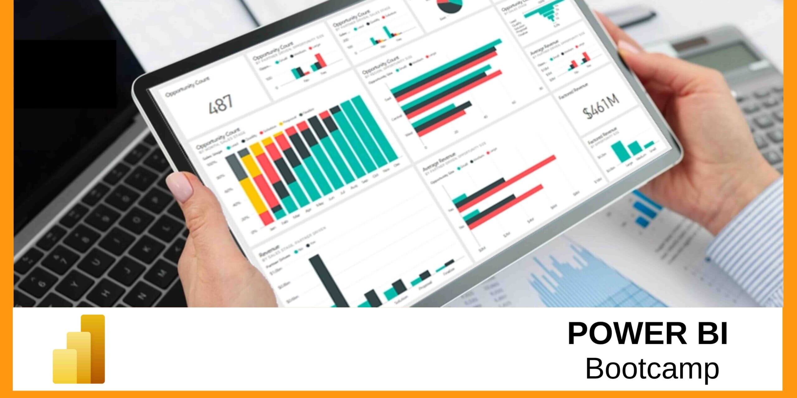
This advanced course is designed to help understand best practices for data visualization with no prior experience. You will view examples from real world research cases and business cases. Visualization is a powerful way to reveal patterns in data, attract attention, and get your message across to an audience quickly and clearly. But, there are many steps in that journey from information to influence, and many questions – what visualization tools should you use, how do you get data into the right format, and how do you put it all together to tell your story? This course will quickly walk you through a wide variety of data types and chart types with particular attention to advanced visualization packages in R and Python. The course will then advance to understanding of Data visualization from a Data Science context. Finally learning about industry use cases relevant to data visualization with partial hands-on labs.
Course Code/Duration:
BDT248 / 1 – Day
Learning Objectives:
- Grasp foundational data visualization best practices, even with no prior experience.
- Analyze real-world research and business cases to understand effective visualization techniques.
- Acquire insights into using visualization to uncover patterns and convey messages effectively.
- Develop proficiency in applying advanced visualization packages in R and Python to diverse data and chart types.
- Basic level experience in one or more coding languages (preferably : Python)
- For anyone interested in Data exploration and Analysis among few titles like Data Analyst, Data Scientist, Data Engineer, Business Intelligence and Analytics Engineer, DevOps, Data Wrangler etc.
- Non-technical professionals who want to start a career in Data Visualization or Business Intelligence.
Course Outline:
Getting Started
- Course Introduction
- Questions to ask – What makes a good data visualization?
- Installing Anaconda – Jupyter Notebooks
Crafting the Story
- Understanding your data
- Understanding your audience
- Exploratory vs. explanatory analysis
- Sketching your ideas and stories
Information Hierarchy
- Focusing on an audience on what’s most important and only revealing details as needed
- Explore – Visual exploration
- Explore – Indexes and ratios
- Convert – Grouping
- Convert – Aggregating
- Convert – Data formats
Storytelling
- Sketches and wireframes
- Defining your narrative
- Keeping audience’s attention – make everything relatable
Data Visualization using Python Libraries
- Overview of Data Visuazalition in Python
- Data Visualization Libraries
- Pandas
- Matplotlib
- Seaborn
Data Visualization using R
- Introduction to R Programming
- Statistical Analysis Process
- Data Visualization
- ggplot2
- Line Chart
- Bar Chart
- Histogram
- Scatterplot
- Box Plot
- Exercise : Data visualization in R
Beyond Python and R Visualization
- Utilize advanced visualization packages in R and Python
- Compare R and Python limitations with other visualization tools, such as JavaScript and Tableau
Conclusion
- Industry Use Case Studies
- Best Practices
- Reference material
- Next steps


